As the sole designer for this design challenge, I needed to understand the landscape for SaaS businesses and how target users choose to subscribe to or discontinue subscription services. I was then able to do a deep-dive by synthesizing my research, conducting sketching workshops, building rapid prototypes to test with users, and finally deliver a high fidelity design for MVP1.
Coral
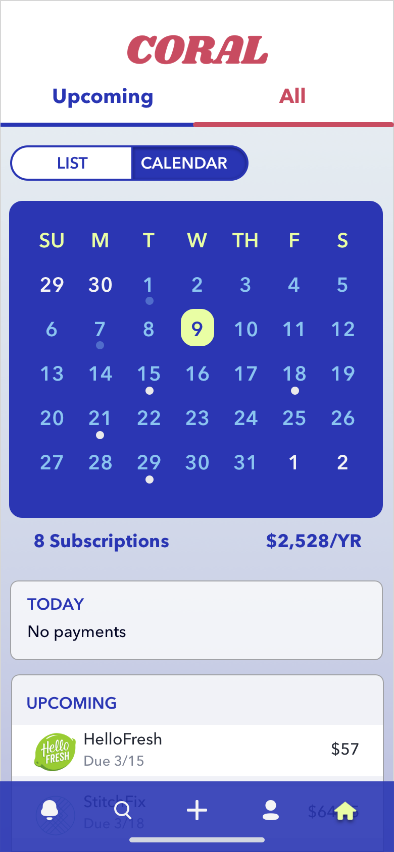
Coral assists users with keeping track of their subscription services through a variety of tools with customizable settings. The mobile application aims to convert web users to using Coral on the go.
Problem: Users easily lose track of their subscription services and are often surprised by unexpected charges.
Make managing subscriptions more convenient?
Provide enough information to keep users informed about all of their subscription service charges?
Assist users with cancelling unwanted subscriptions?
How might we…
Research
The end-to-end design process began with creating a project scope to lay out the steps toward achieving the end goal of a high fidelity MVP. To understand how target users navigate the subscription service landscape the first thing to research was how users were choosing what to pay for out of the wide range of options available. Once this aspect was understood, the next step was to research how users managed their subscriptions (such as selecting a service, deciding how much they were willing to pay for each type of service, and finally deciding when to discontinue a service). The main pain points in this process included the user losing track of the number of subscriptions they were paying for and the frustration involved in canceling a service.
Stage two of research was to complete a competitive analysis of products in the market. Industry standards were identified in successful user flows while missing elements were noted as something to include in the CORAL prototype. The most successful designs featured detailed information about each subscription with ways to customize reminders and filter settings.
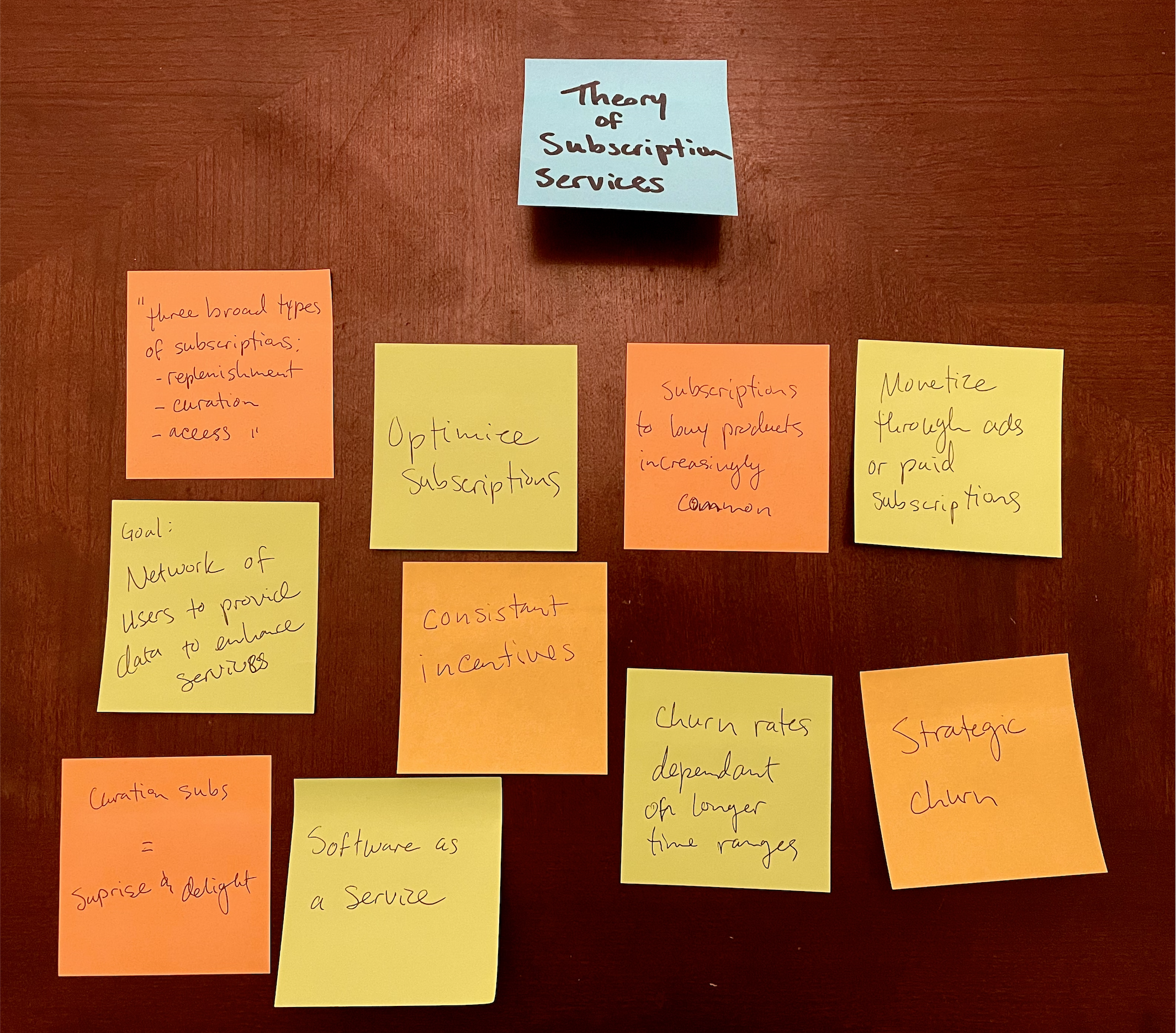
Affinity Map
Using data from secondary research and competitive analysis of similar products, an affinity map was created. After reading through numerous articles and studies, it became clear that:
Users can lose track of their total number of subscriptions, which means...
Many users are unaware of their total subscription costs (per month or year)
It is very common for users to have multiple subscriptions of the same type Ex: both Hulu and Netflix as streaming services
User opinion of a subscription service’s value can change over time based on changes of cost or features available
It is expected that customization will improve over time
Users are frustrated by complicated/time consuming unsubscribing processes
A user persona was determined by synthesizing the insights from the previous research and combining it with the CORAL target user provided by the design challenge.
With the secondary research complete and a baseline established for the industry design standards, I began to design solutions to the pain points reported by the users. To stay within the timeline constraints, the initial layouts for the mobile screens were created as low fidelity wireframes. This made it possible to quickly produce pages that could be used for testing the first prototype while also jumpstarting the design process for the high fidelity screens. A style guide was also created to represent the brand’s identity for future iterations of the product.
Only the most essential information was provided to understand which features users find helpful and to validate the usability of the initial flows. This prototype allowed users to understand what tools were available and how they are able to utilize them.
A series of 5 remote testing sessions revealed that the general flow of CORAL matched what users expect from a product of this type. However, several pain points were revealed through this phase of testing. The results were then compiled in a report which made clear which issues were crucial to fix now versus issues that could be resolved in later MVPs. With this feedback in mind, it validated the need for this product in general with an emphasis on easy use and customizable features.
Pain Points
The language used in the Track a Subscription and Add a Subscription flows made calls to action unclear
When canceling a subscription, users want to stay informed at each stage of the process
Users are always interested in more customization options
Users are interested in seeing more of their usage metrics
Returning to the design phase, the brand identity was applied to the wireframe layouts in order to create high fidelity screens for the final deliverable. The designs were also checked for ADA accessibility compliance.


A second round of user testing was conducted by having 5 new participants test the hi-fi prototype and a new report was created from the high fidelity test findings. Users were able to have a more true to life experience of the product which encouraged them to provide more in depth feedback. Some of the key takeaways from this testing round were:
Pain Points
Not enough information was available in the Reset Password flow. The fields were not clearly labeled and parameters for selecting a new password were not included
Users were unlikely to sit through lengthy tutorials when using the app for the first time
Users are (again) always interested in more customization options
When charges are flagged as potential subscriptions, users want a way to quickly review them
Based on the second report, the most critical pain points, such as a confusing toggle for the list vs calendar view and a lack of information when resetting the password, were corrected. Minor issues were noted for implementation in future MVPs.
Next Steps
My recommendation for the future of Coral would include conducting a third round of testing with new participants to validate the most recent changes. Once the critical pain points are resolved, then MVP 2 should begin by first incorporating the minor pain points mentioned in previous testing sessions then beginning to add additional features. One feature that was often requested is a way to view detailed metrics about how much a user spends on each type of subscription service.


