House to Home
A Design Sprint
House to Home is a web tool that provides customers with guidance for decorating based on different interior design styles. The prototype was created through a modified design sprint in order to find a quick and implementable solution to users decorating frustrations.
As the sole UX designer, the main task was to interpret the primary research data provided by the challenge brief in order to understand what frustrated users during the process of decorating their homes. This would provide the foundation for ideating through storyboards/Crazy 8’s, sketching a solution flow, then using the sketches for a rapid prototype to test with users and validate their confidence in decorating their home with the tools provided.
Problem Statement
Users enjoy living in a comfortable, aesthetically pleasing space that feels like “home” but can be overwhelmed by the time, energy, and money that decorating takes.
How might we…
Empower the user to select items that compliment one another but also fit within an average sized apartment?
Provide a variety of affordable options that users want to keep over time?
Curate objects by aesthetic styles that users are interested in?
Using the problem statements as a guide, different flows for the House to Home site were explored in order to create the initial user flow map
Design Process
The lighting demos prompted out-of-the-box explorations of different interface designs that could be used as the foundation for House to Home. Rather than relying on typical ecommerce sites, designs that prioritized categorization and sorting various items into groups such as Pinterest served as the main inspiration
A more straightforward reference, Zara.com, provided a template for using images that combine different products together to create a story along with straight forward shots that show the necessary details for individual items.
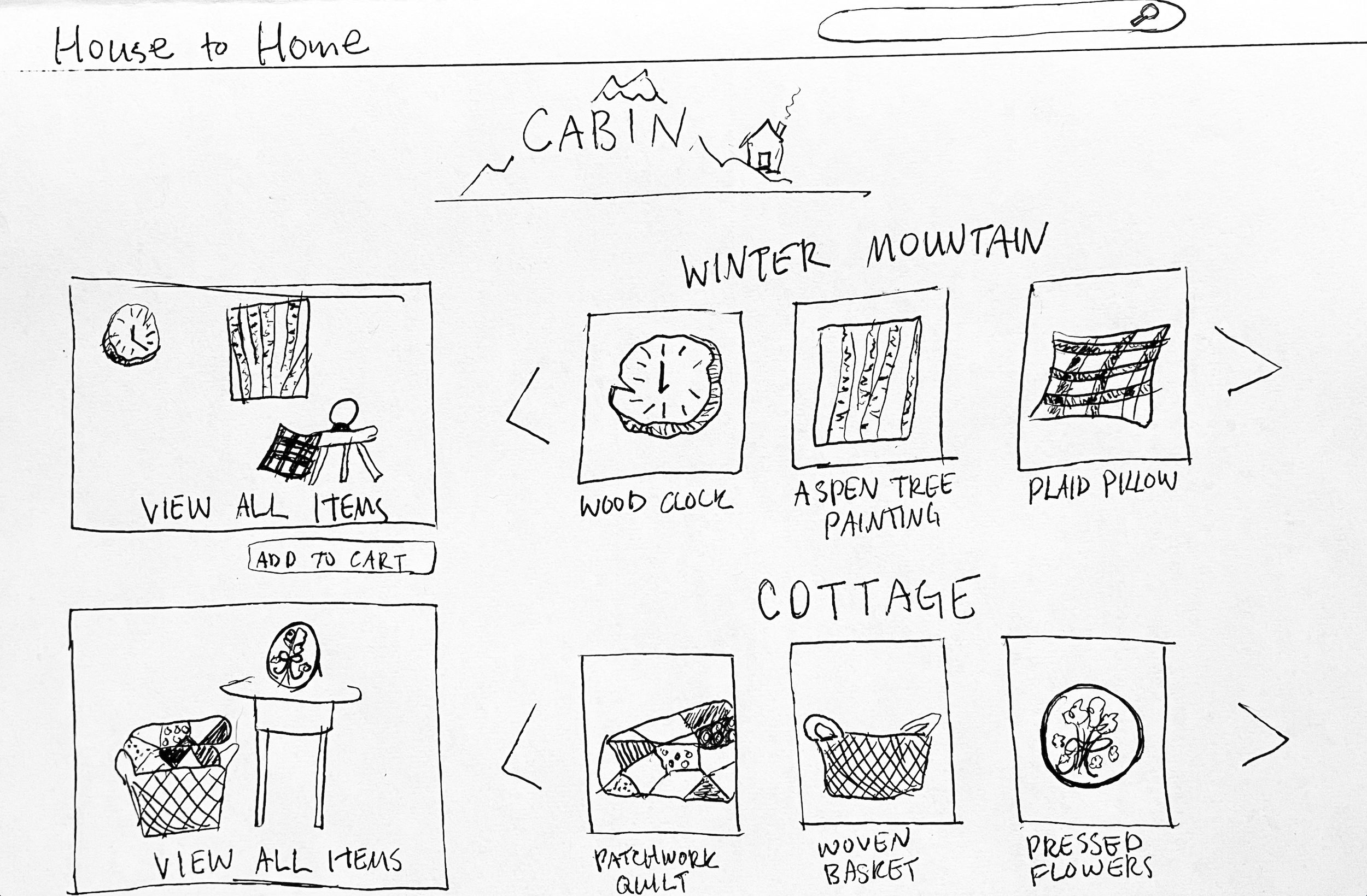
After reviewing research notes and the map from day one of the design sprint, it became clear that the page which would address a majority of users pain points, like user desire for multiple small items but uncertainty for which items work well together, would be the page that displays sets of items to fit different moods/aesthetics. Different variations for the configuration of this page were explored.
The resulting solution includes elements from the research phase layouts. A main image displays all the items in a “set” next to images of individual items so that the viewer understands how each item is used to create the desired aesthetic.
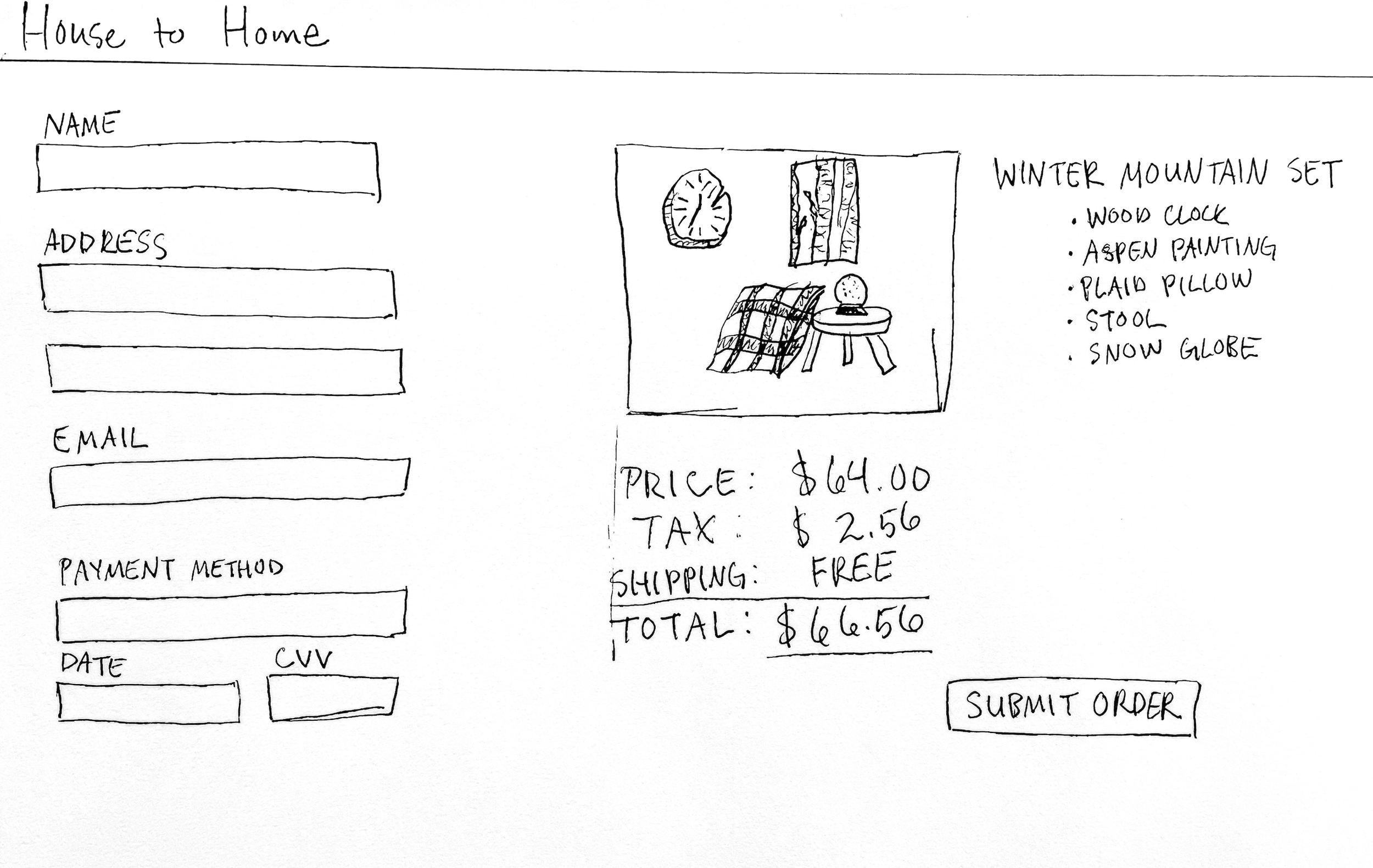
The solution sketch was then used as the starting point for the storyboard flow. By combining an industry standard shopping cart format with a creative approach for displaying groups of interior decorations, users are able to feel comfortable shopping while also being encouraged to explore their own creativity. Images showing the objects for sale both on their own and grouped together show users examples of how they may curate their own spaces.
The rapid prototype for House to Home’s web interface provided only the key information in order to validate the user flow. The general layout allowed test subjects to understand the service that the website would provide without being distracted by high fidelity details. By creating hand drawn sketches of screens in this way, it was quick and easy to test the product for what works without dedicating a large amount of time to building out each screen. This would ensure that the sprint would be completed in a timely manner.
For the final phase of the modified design sprint, 5 users were selected to test the prototype for House to Home below. Users were a combination of 3 ideal customers who needed as much interior decorating assistance as possible along with 2 users who were more comfortable selecting items on their own, but were interested in trying something new. Some users expressed frustration in the amount of time and energy decorating takes, which validated the provided research, but other users were interested in exploring just a few supplemental items to decorate the theme of their current spaces.
Findings and Next Steps
The overall flow of the prototype was clear and easy to navigate, however, some requests for additional options/clarifications were mentioned. The highest priority fix for the next phase of House to Home is to continue improving the visual hierarchy for the most critical “Moods” screen. Better spacing of the “set” categories and clarification on calls to action would increase usability and encourage users to proceed with a purchase. Cost conscious users wanted more price information about individual items included in a bundled “set”, but generally were happy with the total price for all items included. One user in particular pointed out a desire for the option to continue adding things to cart at each stage or the check-out process, which is another addition to consider moving forward.


